When it comes to your website, the contact page might not be the first thing on your mind. But let me tell you, it’s like the hidden gem in the treasure chest of your online presence. A well-designed contact page is essential for diverse visitor needs and for fostering crucial business interactions. It’s where potential clients, customers, or even collaborators can reach out to you. So, if you want to shine bright on the digital landscape, you better pay attention to your contact page.

In this SEO-enhanced guide, we’re diving deep into the art of crafting the perfect contact page. We’ll explore tips and tricks that will not only improve user experience but also give your website a boost in Google rankings. So, fasten your seatbelts, because we’re about to embark on a journey to design the ultimate contact page that stands out from the crowd.
The Foundation of a Great Contact Page
Your contact page is more than just a list of ways to reach you. It’s a reflection of your brand, your commitment to user satisfaction, and your professionalism. Here’s how to build a solid foundation:
1. Research Your Audience

Before you start designing, get to know your audience. What are their preferences? Do they prefer emails, phone calls, or chat? Understanding your audience’s needs will help you tailor your contact options accordingly.
2. Choose the Right Contact Methods
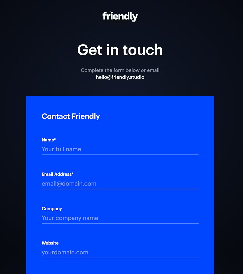

There’s no one-size-fits-all approach. Provide a variety of contact methods to cater to different preferences. From traditional methods like phone numbers and physical addresses to digital options like chatbots and contact forms, cover all the bases.
3. Prioritize Diversity
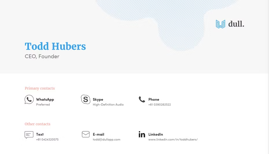
Think beyond the basics. Offer diverse contact methods like email, social media, WhatsApp, and even messenger apps like Facebook Messenger or Telegram. The more options you provide, the easier it is for users to connect with you.
Designing for Clarity and User-Friendliness
A contact page should be as clear as a mountain stream, with no obstructions in the way. Let’s ensure that your visitors can easily find their way to you.
4. Keep It Clean and Clutter-Free
Simplicity is key. A clutter-free design minimizes distractions and helps users focus on the essential task at hand: getting in touch with you.
5. Visual Separation
Visually separate different departments or contact methods. Use headings, icons, or even colors to make it crystal clear. This way, users can quickly identify the right point of contact.
6. Accessibility Matters
Not everyone navigates the web in the same way. Ensure accessibility by using tagged form elements, reducing cognitive load, and incorporating clear visuals. Everyone deserves an equal opportunity to connect with you.
Brand Consistency and Engagement
Your contact page shouldn’t feel like it’s from a different planet compared to the rest of your website. Let’s maintain that consistency and add a dash of engagement:
7. Consistency Across the Board
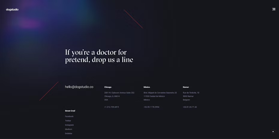
Your contact page should be in harmony with the rest of your website in terms of aesthetics and tone. Consistency builds trust and ensures a seamless user experience.
8. Engage with Creativity
Don’t be afraid to get creative. Personalized photos and interactive chatbots can make your contact page more engaging and memorable. Give your users something to remember you by.
Transparency is Key
In an age where data privacy and trust are paramount, transparency is non-negotiable:
9. Inform Users
Let your users know how you handle their data and what to expect in terms of response times. Transparency fosters trust and shows that you value your users’ time.
Inspirational Examples
Let’s take a peek at some exemplary contact pages that have mastered the art of user engagement:
Telstra
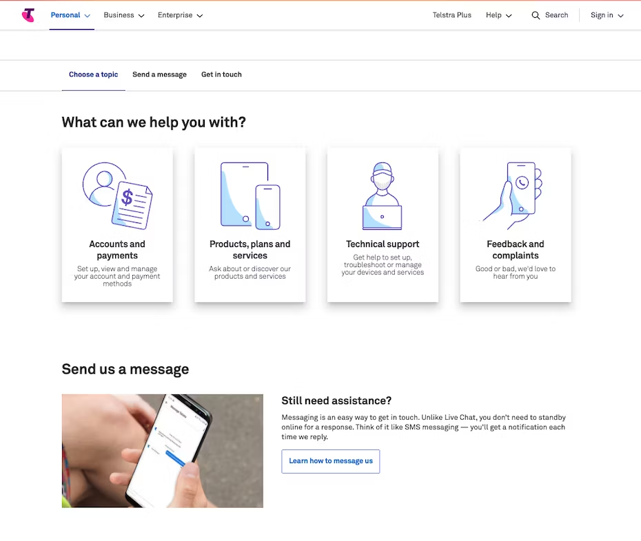
Telstra’s contact page offers a clean and straightforward design, making it easy for users to find the information they need.
Nestle
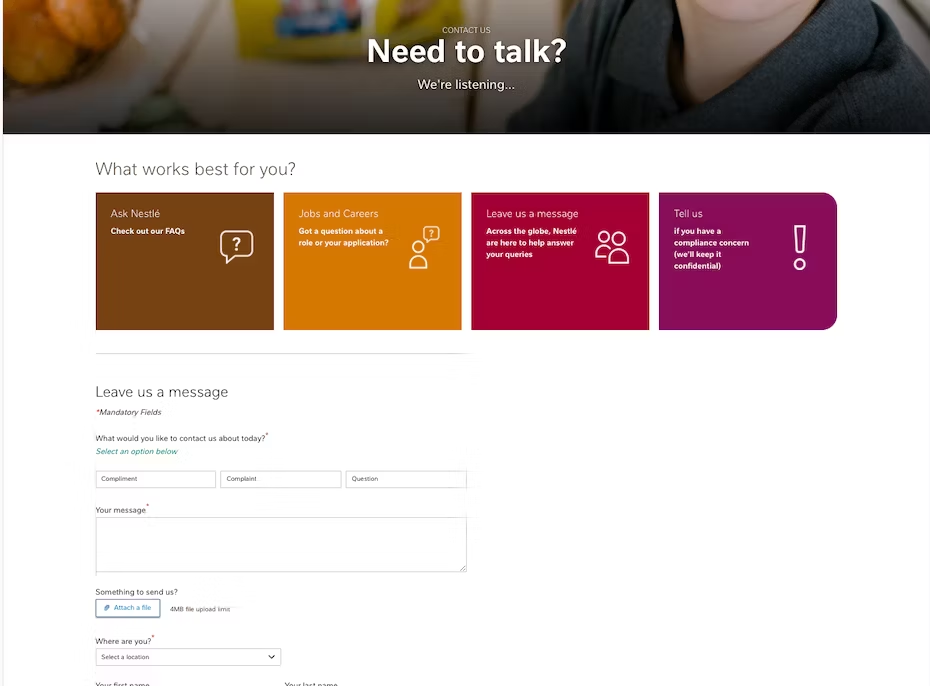
Nestle excels in diversity by offering multiple contact options, including social media and chat support.
Fishfingers
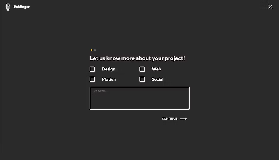
Fishfingers stands out with its creative use of visuals and interactive elements.
Gander
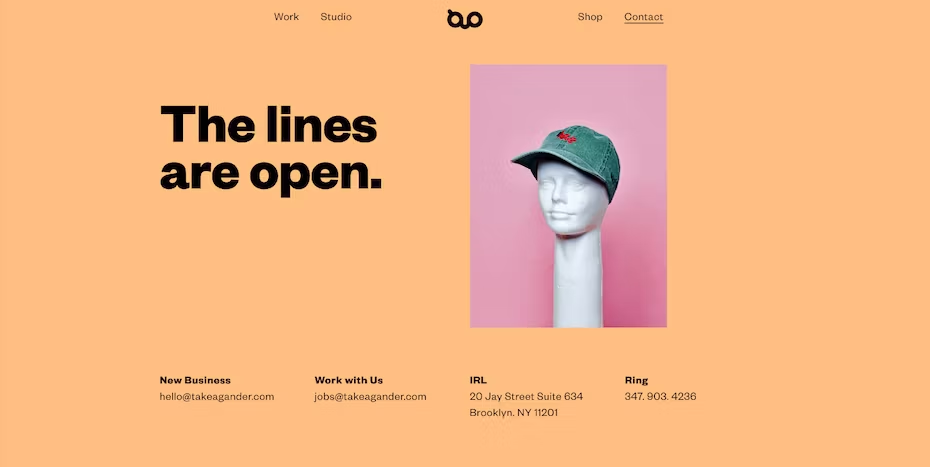
Gander’s Get in touch page maintains brand consistency while providing a range of contact methods.
Conclusion
Crafting a stellar contact page is more than just a technicality—it’s an art. It’s a way to bridge the gap between you and your audience, to open the doors of communication wide. By following these 7 tips, you can create a page that not only satisfies your visitors but also elevates your website’s SEO game.
FAQ’s
A Get in touch page serves as a gateway for visitors to get in touch with the website owner or organization. It provides various contact methods and information to facilitate communication.
Diverse contact methods cater to different user preferences. Providing options like email, phone, chatbots, and social media increases the chances of users reaching out in a way that suits them best.
To make your page more accessible, use tagged form elements, reduce cognitive load, and ensure clear visuals. This ensures that users with disabilities can navigate and use your contact options.
Brand consistency across your website, including the contact page, builds trust and recognition. It reassures visitors that they are in the right place and dealing with a professional organization.
Transparency on a contact page involves informing users about how their data is handled and what to expect in terms of response times. It builds trust and sets clear expectations for users.
Incorporating these contact page design tips into your website can make a world of difference. Remember, your page is more than just a form—it’s a bridge between you and your audience. Make it inviting, make it accessible, and make it memorable. Happy designing!


