Humans Valued looks & significance from the beginning of time, As an Outcome, we’ve maintained an upward direction of growth in both craft and technology. Also in the virtual world, The Exact Movement continues. When A Website is Engaging & caters to the requirement of People, They Probably Came Back to the website, The real estate industry does not have any exceptions, nowadays already 4.38 billion humans using the Internet, and they spend 6 hours & 42 minutes online every day. it’s mandatory that every company including real estate Agents Or Agencies Should Have Their Website.
Also, only A website with fantastic aesthetics and value delivery can be ranked and gain more customers. it’s critically important for a real estate agent to know Which Components can make their website stand out from their competitor.
Because owning a Well designed & developed website is a difficult task, We Are presenting websites that are already successful, if you like any of them You just have to contact your Website design company and share a link, if they are capable, they can easily build a website based on a link of your choice with custom features.
We Discovered 50 real estate websites that are successfully running, and we rank them based on Design, Visuals, User interface, User Experience, Colors, and Custom Features.
And We Filtered the best 10 websites which are the Best Real estate websites of 2022, Have a Look at them, & Decide Which one you like The Most.
1. HAR
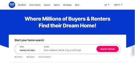
Har.com Tried to value pack their Real estate Website, they set an excellent Focus on aesthetics. The bright background on the Home page is proof of Outstanding taste.
Also, They Have Searchbar, Which Helps Users to easily find Houses by Drive time, Nearby schools, sale/rent options, Price range, and the number of bathrooms and baths.
They Bring user experience to the next level and makes them stand out from industry competitors, by having a more filters button under the search bar, it navigates the user to another page that has other filters like architecture style, Property size, and type and numbers of garages.
Also, it allows users to choose amenities like a media room, sprinkler, study room, wheelchair, private pool, spa, and so more, you can check it out here.
Website: https://www.har.com/
2. The Home Like
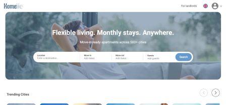
If you desire an example of a fascinating website that also keeps desirable grades of efficacy, you’ll enjoy visiting The Home Like. The image in the background shows a relaxed lady, converting a sense of comfort and relaxing taste,
Downside they have trading cities which give users to look at the cities which people are visiting, when someone clicks on the city, it will take the user to another page with a listing of that city, which enhances the user experience to another level,
To improve user experience they made this site multilingual, users can access this site in 6 different languages, People will naturally attract more when they can consume the content of the Website in their own language, it’s a smart way to improve user engagement!
We must have to mention that on the home page they have a search bar with “move in”, “move Out”, & “guest” Options, which is very helpful for people in hurry.
Website: https://www.thehomelike.com/
3. Tommy’s Real Estate
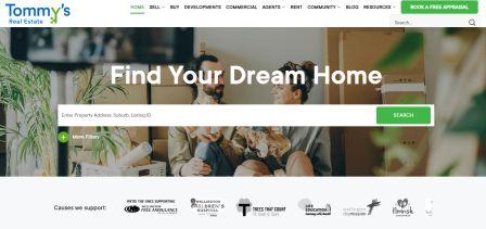
When choosing to buy or rent a home, a key aspect for most people is the distance of the property in question from Their workplace. Holding that in sense, Tommy’s has put a drop-down menu switch in the center place of their website that permits their guests to select their office area when digging for homes.
Their home page background choice is superb as well! All the images they have selected speak of the family joy & entertainment that people desire from their own houses.
Besides, they have also put the button so that their valued guests have entry to a more significant number of search standards. Upon clicking, it pops out a window while holding the user on the exact page.
This window extends up with better filters for search comfort. These filters contain the city, suburb, property style, minimum and highest price, number of bedrooms and baths, and so on.
One of the items most deserving of recognition on their website is the positively observable“BOOK A FREE APPRAISAL” button; standing out as it is green ground against a white background. This is probably one of the causes behind their increased conversion speed.
Website: https://www.tommys.co.nz/
4. Real Estate
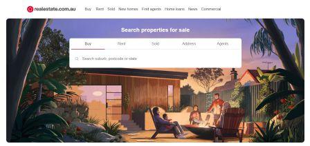
Every most useful real estate website includes one essential element in common. They provide users with the choice to search for a property by type, minimum and maximum number of bedrooms. RealEstate.com.au, in its try to be helpful to its visitors, has included this segment as well along with some better ones.
What benefits RealEstate.com.au stand separated from its competitors is that it has retained its “Home Loans” button in the first fold of its website. The subheading is engaging as well! When guests see that they can be given loans from people they know, they want to know more!
Final, but not least, RealEstate.com.au lets guests search for roommates and rooms for rent; the “Share” button takes people to the related page.
As you can notice, they have brought excellent care in selecting the background illustration. This picture conveys of friendship, sharing, and fun; all associated with having roommates.
Website: https://www.realestate.com.au/buy
5. Domain
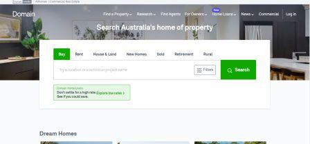
Not like others on this index, Domain has placed a fairly small focus on aesthetics. Yet, they hold better than made up for it with expansive value delivery in the content-full track! In fact, that is the cause they are on this index.
You have the standards to efficiently find home loan lenders. Also, you’ll be capable to locate repayment, stamp duty, and equity fees utilizing on-site calculators.
Domain even allows you to create an advised judgment via their study materials. These contain advice, reports, sold properties, and property-price calculations. These can be located in the “Research” tab in the navigation.
That’s not all. On the Website, you can discover help on utility link building, insurance policies, home price guides, and profiles of the suburb you plan to purchase a home in. These can be located in the “More” menu.
The button named “Filters” on the direct left of the large green “Search” button allows you to extend up a pop-out window when clicked. This window includes a field of filters to tighten down your search. Have a detailed look at these in the images down. These certainly enhance user experience and would be worth executing on your own real estate website.
Website: https://www.domain.com.au/
6. Residences-Immobilier
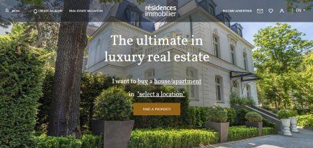
Residences-Immobilier does not greet its guests with a video in the hero banner, it is better than creating up for this with neat navigation. With only five things in tiny font positioned at the top left and right corners, the nav bar is generated nearly transparent. In this manner, ultimate user engagement can be referred to as the “FIND A PROPERTY” CTA.
Let’s speak regarding their search bar. When you click on the CTA, a search bar with numerous standards (buy/rent/short-term rent, house/apartment, and location) extends up on the same page.
The hamburger menu has numerous essential choices for guests such as properties on the deal, short-term rentals, magazines, connection choices, and so on. As Residences-Immobilier specializes in luxury properties, they have selected their Website hero pictures accordingly.
We can notice stunning images of the magnificent luxury bungalow covered by greenery.
Website: https://www.residences-immobilier.com/en
7. JOHN TAYLOR
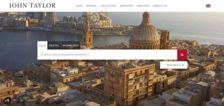
When it arrives to building worth, while having an attractive glance, JOHN TAYLOR has accomplished a satisfactory job. After logging onto their website, guests are welcomed with a video demonstrating some glorious architecture and stunning locations like the Alps and the seaside.
The overhead-the-fold content just Contains a search bar that can be utilized to discover real estate for sale and rent. The switches at the top are hover-sensitive. That indicates you do not require to click on them to extend the drop-down menus. Among these buttons, there is one at the top right that allows you to select the language for the Website. These are positioned against a white background which indicates they do not divert concentration out from the center.
The “More Options” button below the right of the search bar extends up a little container on the exact page. On this window, you have the choice to select the class of property you are curious about, the digit of bedrooms you desire in it, and the scope of funding you would be restful with.
Website: https://www.john-taylor.com/
8. Foxtons
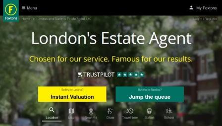
We instinctively associate our houses and neighborhoods with ease, peace, and wealth. The video experience of Foxtons, UK says this intuition.
The exact composition led Foxtons to select yellow and green as the primary colors for their logo, CTA, and so on. The “Buy” button, shown by the red box, has a drop-down menu that lets guests select the period that they would like to rent a home.
Just like this button, the search field is multi-functional in the reason that it allows you to search for a house by location, postcode, school, or station. Right over this bar is the search standards that allow you to discover homes established in your area, journey time, etc.
In extra, this website boasts a one-line sub-heading and rating based on reviews from over 5000 people.
Website: https://www.foxtons.co.uk/
9. Home Light
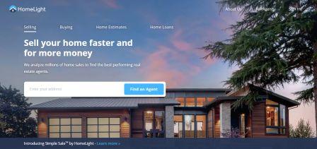
Home Light Florida has chosen to uphold their above-the-fold content as hygienic as likely. The hero banner, which indicates a neighborhood in Florida, is really the background against which all content includes been put. This content just contains a straightforward yet smart headline, a search area to find agents to sell your home, and a sub-heading, which provides the Website with a clean face.
the search field is in the middle, so guests would sense forced to type. Again, all the buttons at the top are really drop-down menus. This even donates to the hygienic sense of the rather contentful page.
Their essential part, “HomeLight Simple Sale”, which allows people to discover a calculated sale price for their home in 2 minutes and also reveals their home to pre-approved cash customers, is embedded in the “SELLERS” button at the top.
Website: https://www.homelight.com/
10. Toll Brothers City Living

The point you Visit their website, Toll Brothers City Living greets you with a video helicopter view of the stunning skyline of New York City! It even brags about one of the most hygienic home pages in the world.
Toll Brothers City Living has worked to accomplish this in 3 ways:
- Putting all suitable and required navigation bar entities into a hamburger-style menu.
- Creating the full bar hover-sensitive. In this method when the mouse is dragged to the top part of the Website, the hamburger extends showing its contents.
- Use a title and sub-title which are straightforward, to the point, and as fashionable as the skyline in the video.
Their improved focus on aesthetics will leave any visitor spellbound, with no choice but to scroll down or click “SEE THE PROJECTS” to research what’s offered!
Conclusion
Every niche is special, simply as every individual is special. The website samples in this Blog are not to be duplicated precisely; based on the information you have on the people in your location, you can customize your website so that it aligns with their intentions.
Recognize, that developing the right connections with your consumers will always be necessary if you desire to be a long-term player; your website plays a vital part in that, so take efforts to create a website that encourages such connections. And appreciate the fruit of your victory!


